Hodsock Priory · 4 July 2026
Olivia & Matthew
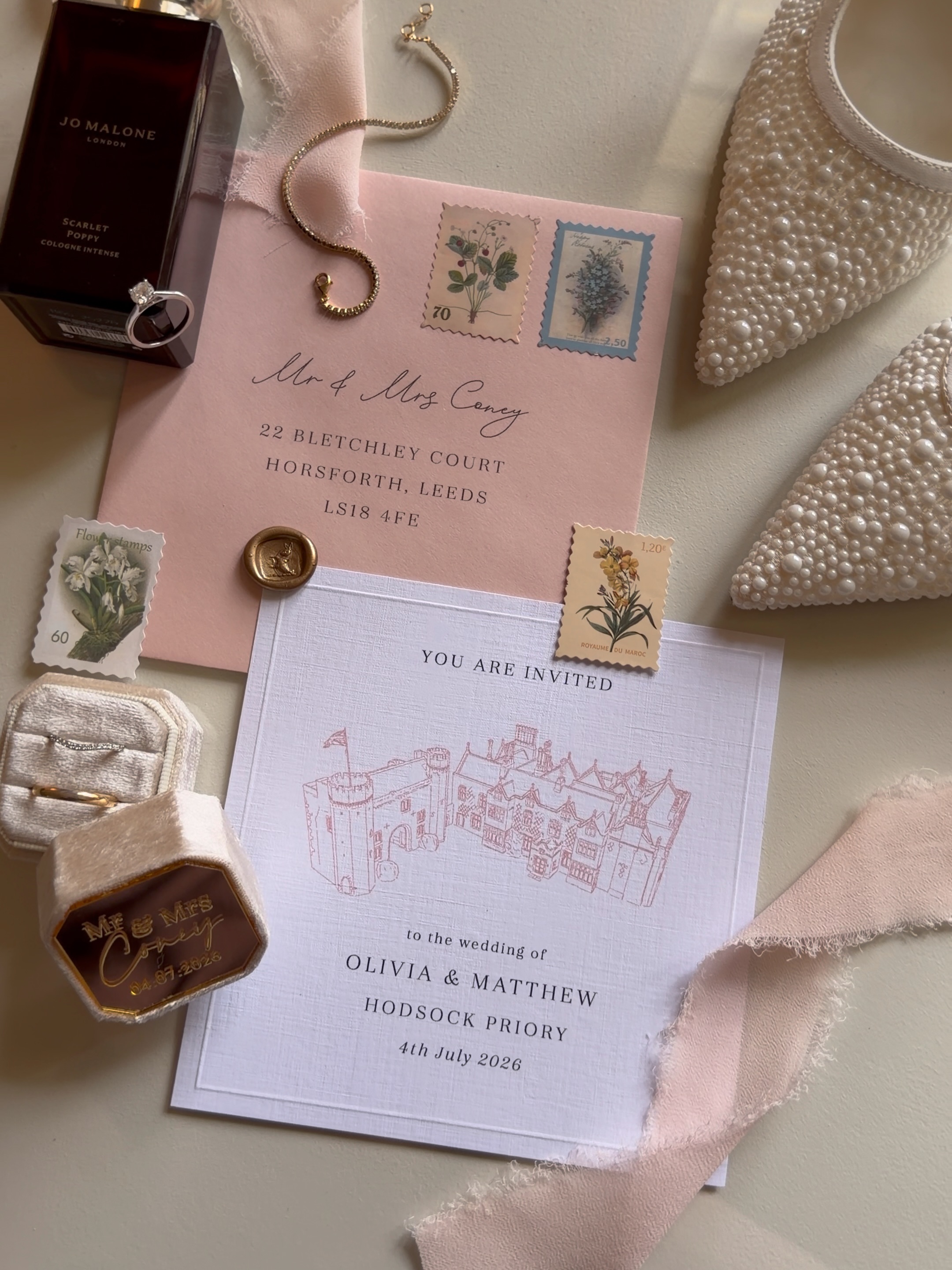
Classic, traditional, pastel wedding stationery at Hodsock Priory.
Colour scheme
The palette
- Blush
- Baby pink
- Baby blue
- White
- Gold
- Ink
The brief
What they wanted
A classic Hodsock Priory wedding with a soft pastel feel. Olivia and Matthew wanted stationery that felt keepsake-worthy from the first save the date through to the on-the-day details, tied together by a custom line drawing of their venue.
The process
How we got there
The palette
Neutrals and blush for the invitations, opening into baby pink, baby blue and white for the day itself, with gold accents and dusty rose chiffon.
The typography
Loose handwritten script used in conjunction with a clean classic serif. A classic pairing, carried through from the invitations to the on-the-day details.
The finer details
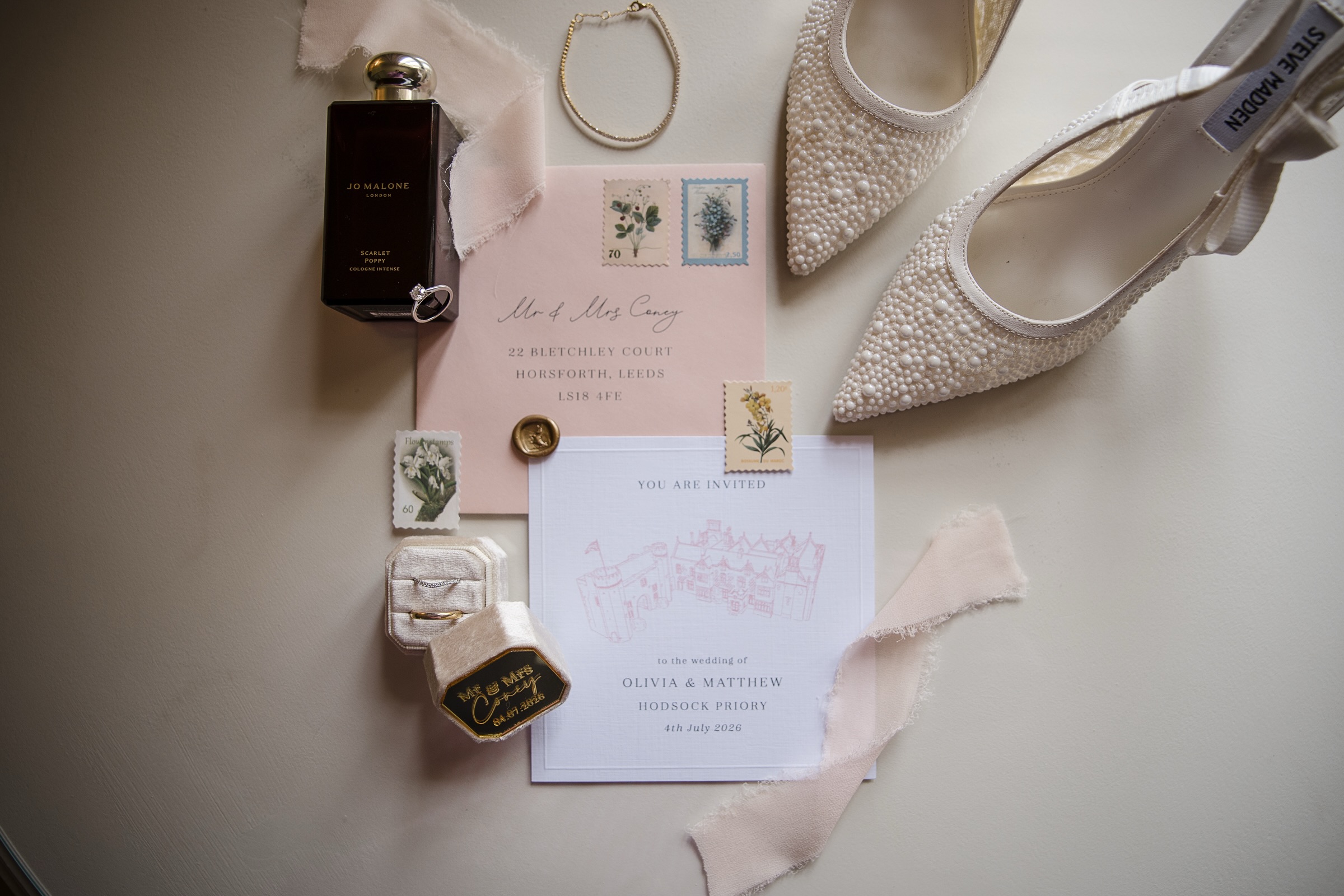
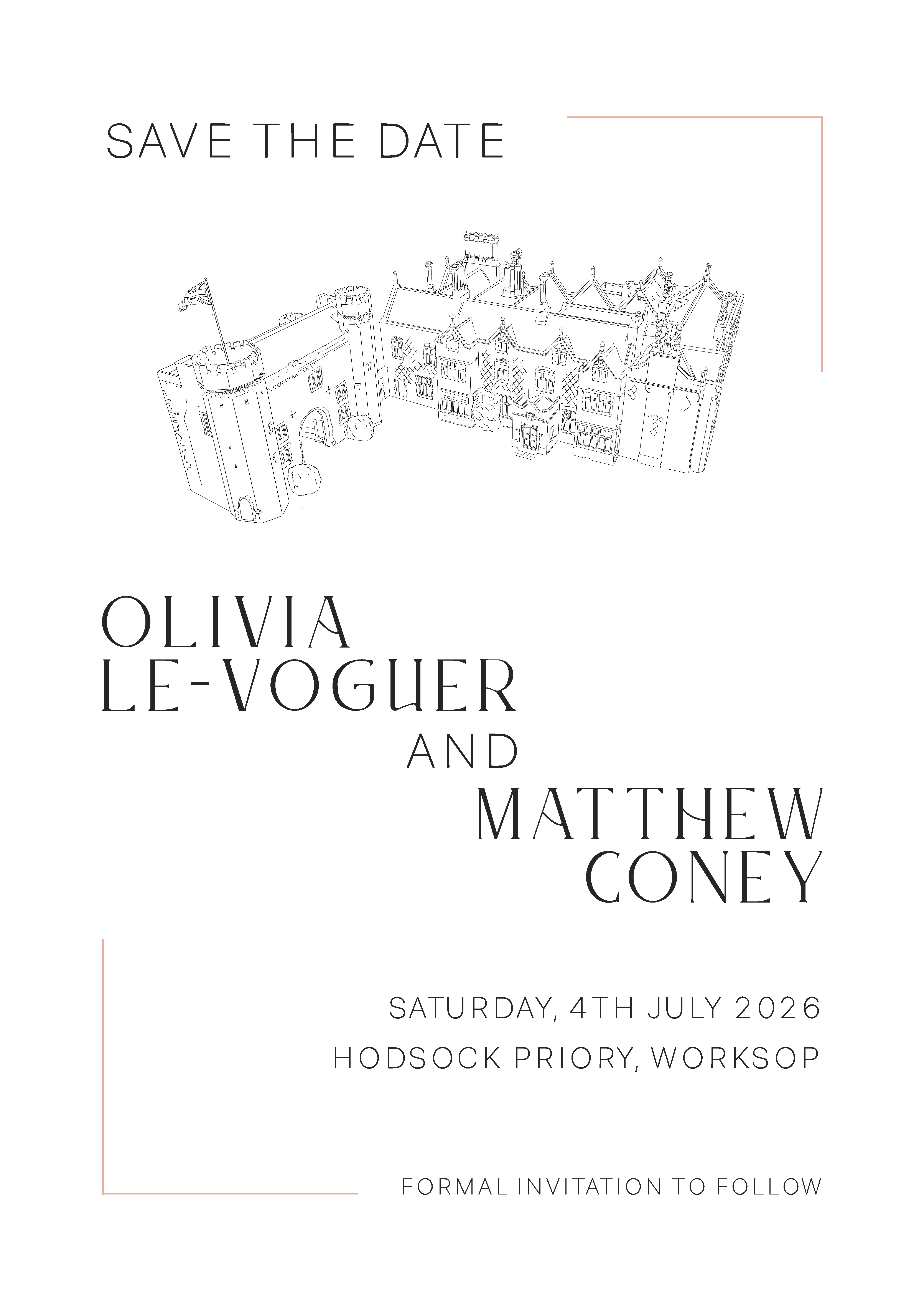
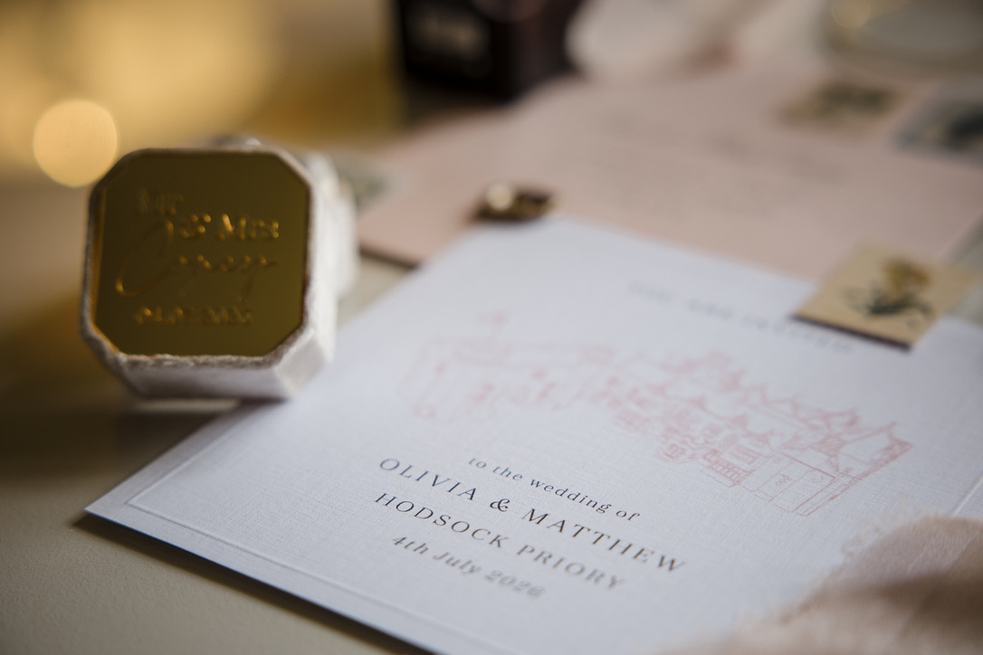
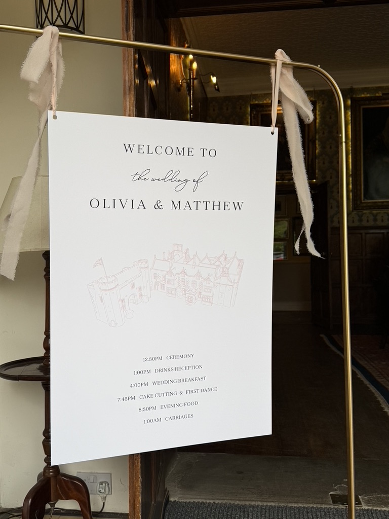
A custom line drawing of Hodsock Priory, a pastel floral watercolour envelope liner, and a wax seal of the groom’s family crest taken from his signet ring.
Carried through
The illustration and palette flow through invitations, welcome sign, order of the day, seating chart and floral place names for a cohesive suite.
What we created
The stationery suite
Save the dates
Digital save the dates featuring the custom Hodsock Priory line drawing.
Invitation suite
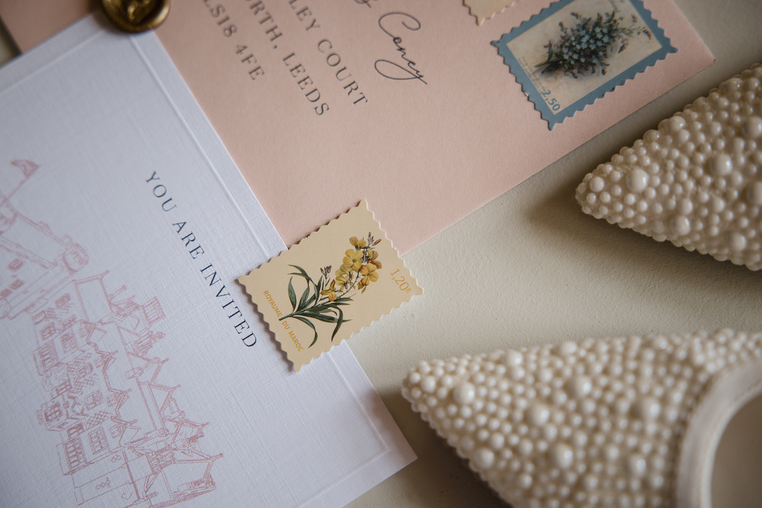
Blush envelopes with calligraphy, botanical stamps and a gold wax seal.
Welcome & order of the day
Printed on foamex with a gold stand and dusty rose chiffon ribbon.
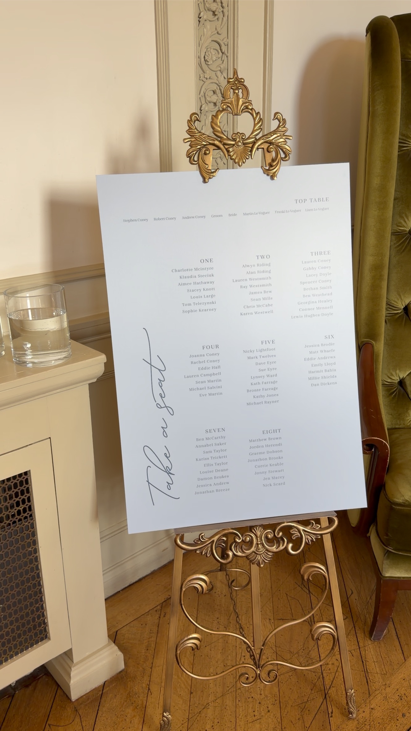
Seating chart
A “Take a seat” seating chart displayed on a gold easel.
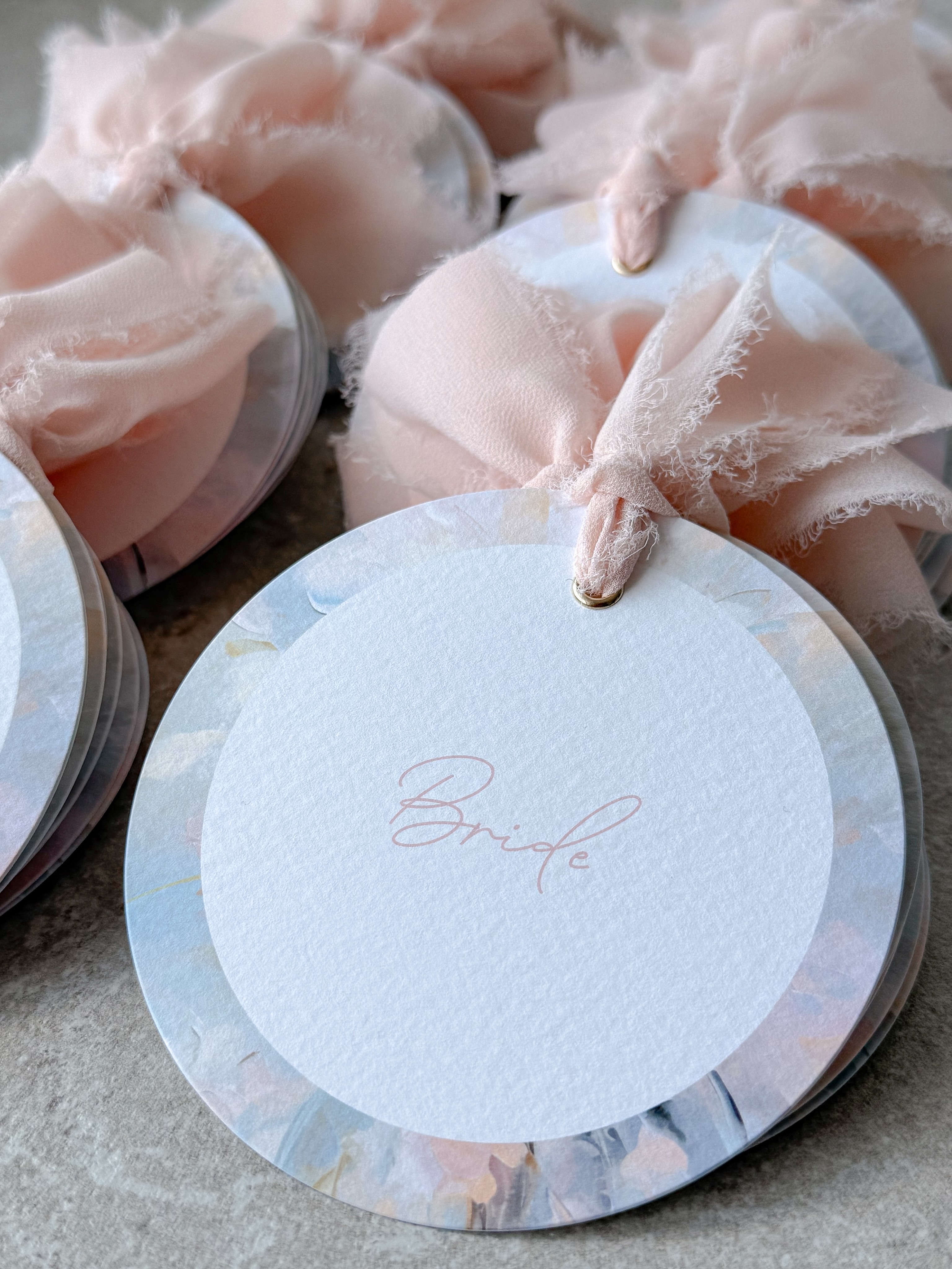
Place names
Circular floral place names with gold eyelets and chiffon ribbon.
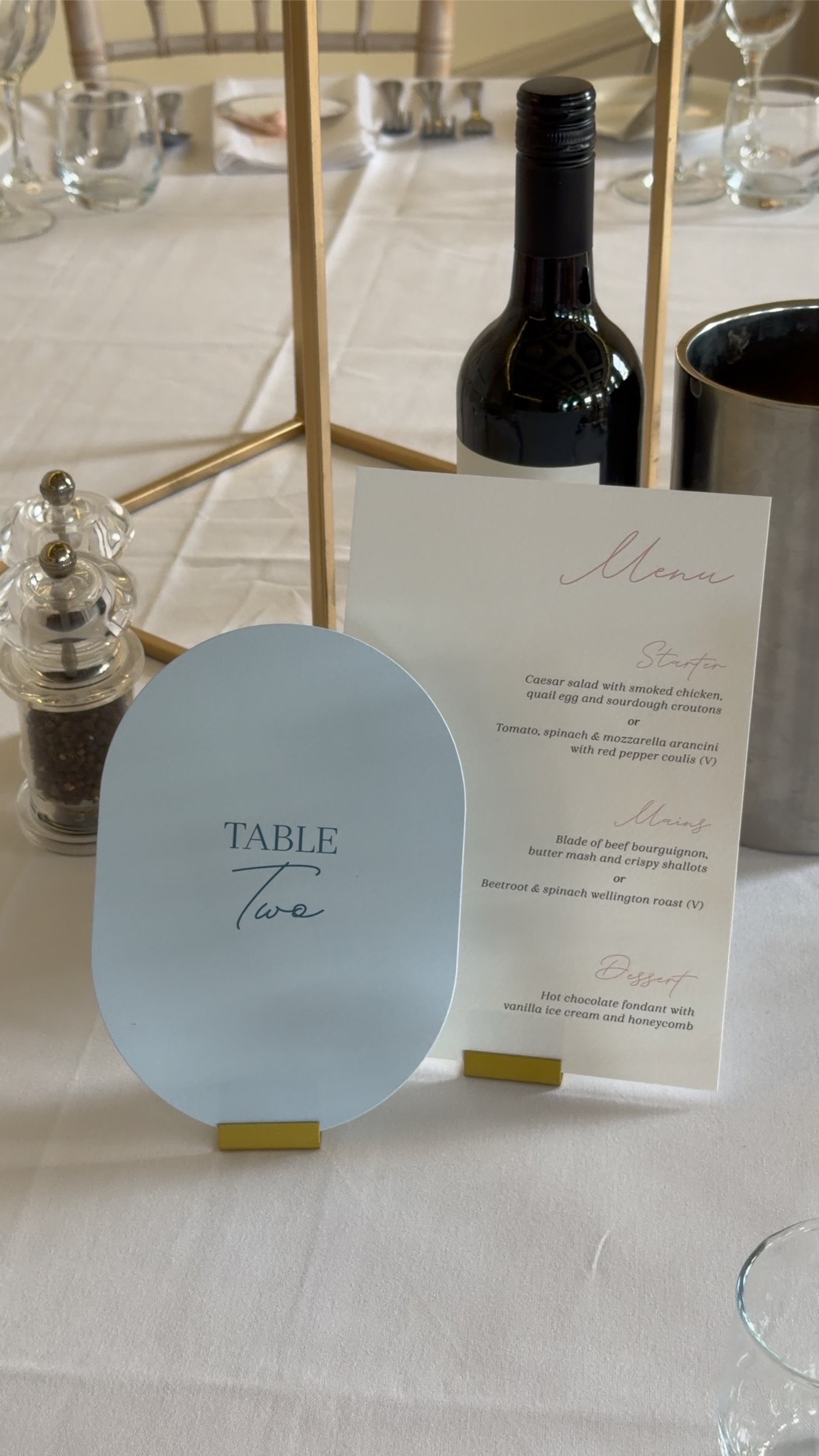
Menus & table details
On-the-day menus and table numbers designed to match the suite.
Gallery
The finished suite